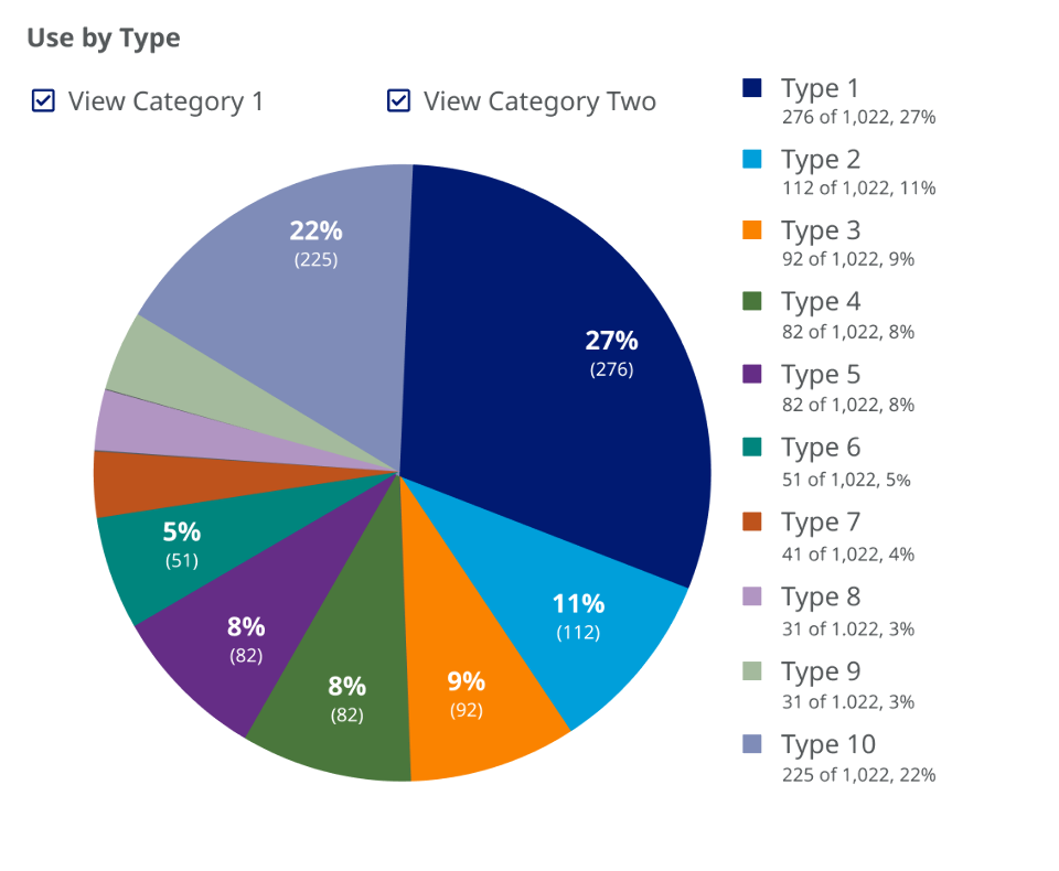
Our client was in the process of converting a widely used reporting tool from simple table representations of quantitative data to graphical representations, with the goal that these data visualizations would be easier to interpret. Daedalus was engaged to create an all-day workshop to support this endeavor.
We started the workshop by helping the client’s stakeholders to better articulate the who, what, and why of the data visualization tool: who the users were, what they were trying to accomplish, and their motivations for doing so. We walked through best practice design visualization guidelines and explored examples of real-life data visualizations that successfully accomplished their goals, as well as those that failed to do so, analyzing the attributes that led to the successes and failures. We led the client’s team through idea-generation sessions to graphically communicate trends and summaries of several of the data tables. After the session, we refined and expanded on the concepts created and provided the client with a minimum viable product for development.